Since the global pandemic has made many people uneasy about going to the doctor’s office, apps have become a key method for users to communicate with their doctors and specialists. However, current medical apps tend to be wordy, using few graphics, and might not be user-friendly to people with vision impairment or learning disabilities. Also, the last couple of years have brought increased anxiety and stress for many, especially those who were laid off, who are from marginalized communities, or who have pre-existing mental health concerns.
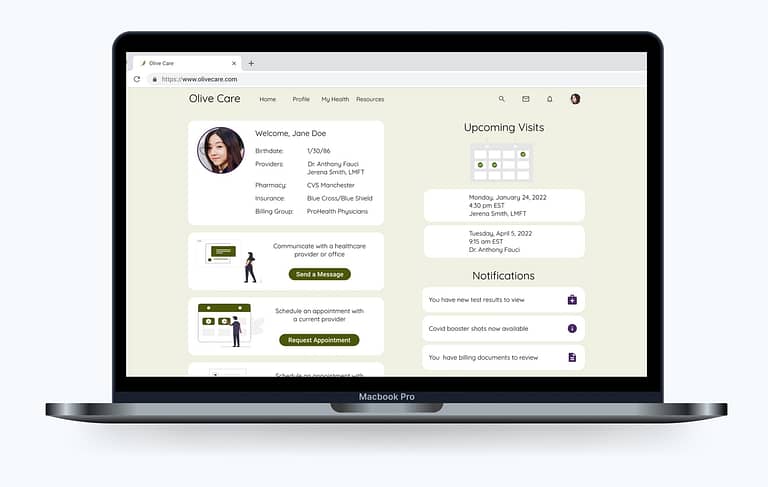
Olive Care is a patient portal application that allows users to communicate with healthcare providers, save and retrieve their medical records, and access wellness educational resources. Here is my design process.
Role
For this school project I was the sole UX designer, so I managed everything from research, information architecture, design iteration, and testing, to the final mockups.
I began this project with user research. This helped me to empathize with potential customers, understand the competition and the market for these apps, conduct user research, create a hypothesis, ideate, create wireframes and prototypes, test my hypothesis and my designs, and update the app based on actual user feedback.
Research
The first step was to define the problem.
PROBLEM STATEMENT
Our users need a way to record their medical information, interact with providers, track appointments, and access educational resources, because they wish to take control of their health and wellness.
We will know this to be true when we see users managing their medical information across providers, creating healthy habits, and leading a balanced lifestyle over at least six months.
HYPOTHESIS
We believe that by designing a responsive health and wellness web application for our users that gives them access to their medical records, the ability to find and communicate directly with providers, and access to educational resources, we will achieve the goal of helping them track current and past health concerns, get the answers they seek, and empower them by giving them control of their health and wellness.
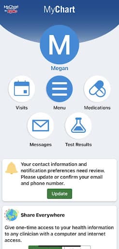
COMPETITIVE ANALYSIS
I analyzed two top-rated patient portal apps: MyChart and FollowMyHealth. This helped me to understand who my main competitors are, as well as get a good sense of their strengths and areas of opportunity.
Competitor: FollowMyHealth
Strengths:
Consistent and reliable with the essential functions such as making appointments, checking records, viewing results, and sending a message to doctors
Allows users to make changes to their records
Weaknesses:
As an inexpensive option, they don’t provide much support to the healthcare organization implementing the app
Does not have the ability to let users change or update their insurance information
Feels like a bare bones application
Opportunities:
A more user-friendly interface to make it clearer to new users what they can do within the app
Video conferencing or live chats with someone from the user’s medical team
Allow users to upload pictures of their insurance card
Add an educational resources feature
Threats:
Other patient portal apps such as PatientPORTAL by InteliChart, My Health Records, and MyChart
Competitor: MyChart
Strengths:
Very user-friendly interface
Features and navigation are highlighted and easy to find
The ability to explore research studies
Works well on any screen
Video care on demand
Weaknesses:
As an proprietary software, this is an expensive option for the healthcare organization
Some users experienced functional issues with the recent redesign
So many options it can be confusing where to find certain information
Opportunities:
Allow patients to merge records from other doctors
Add a centralized section that gives the user an overall snapshot of their health, including allergies, conditions, immunizations, vitals, etc
Threats:
Less expensive patient portal apps such as PatientPORTAL by InteliChart, My Health Records, and FollowMyHealth.
Business Requirements
At this point, I crafted the business requirements document, linked here.
Observe
SURVEY
I conducted a survey to collect data on the context in which people would use a health and wellness app, as well as to discover users’ pain points with the current apps on the market.
Survey conducted via Google Forms
17 respondents
8 questions
Promoted on CareerFoundry Slack and Discord
Click the image for enlarged view
SURVEY INSIGHTS
Most respondents use more than one type of health-related app, currently. Over 75% would prefer to use one app as the central hub for all their health and wellness needs. Medical and exercise features are of the greatest significance to most respondents, but mental health options prove to be very important, as well. The ability to customize the app is also of interest.
USER INTERVIEWS
Building off the data I collected during the survey, I conducted three user interviews to better understand user behavior around mental health activities, tracking medical appointments and records, and to determine which tasks users would like to accomplish with a holistic health web app.
Click the image for enlarged view
INTERVIEW INSIGHTS
The interview participants differed from the survey respondents in their interest for a central health app. They each expressed a desire to maintain multiple apps, mainly to access different study findings and data sets for medical topics and issues.
All the participants have experienced a change in their medical interactions as a result of the pandemic, as well as an increase in health-related anxiety.
Many people live on a tight budget and can’t afford premium fees for app extras.
Users aren’t always made to feel like a whole person in their medical interactions, so it will be key to offer features for mental as well as physical health.
CONCLUSIONS
Access to personal medical data is of great importance to most.
Mental health and stress management resources are desired, but are not being used by most at this time.
The majority of users do not want to pay for a health app.
Customization options would help users take advantage of the features important to them.
Some users are resistant to a health & wellness app due to concerns with the medical and pharmaceutical industries.
Users vary in their frequency and consistency when using health and wellness apps, so it is important that the app is as accessible for people who use it every 6-8 weeks as it is for people who use it daily.
Point of View
I created three personas based on the data from my survey and user interview results.
Ideate
USER JOURNEY MAPS
To gain a deeper understanding of my users I created a journey map for each persona to visualize what they experience when accomplishing a goal.
TASK ANALYSIS & USER FLOWS
Looking back at the user stories I created at the beginning of the project I defined the top three objectives for users of my app, referencing the information gathered from my personas. This helped me determine which tasks would be required to complete each goal. From here I created my user flows.
SITEMAP
I began ideating on the architecture of my app and created a first draft of the sitemap.
CARD SORTING
Once I had a draft of the sitemap I needed to evaluate the validity of my proposed information architecture. I conducted an open card sort using the tool OptimalSort.
80% of the participants created a dashboard-type category. None of the participants created a separate category for Test Results or Find a Provider, but instead grouped these topics with the health summary categories. I was surprised to see that Blog was just as likely to be categorized with Send a Message as it was with Articles. I chose to rename some of my categories and reorganized the pages for a more intuitive flow.
UPDATED SITEMAP
Prototype
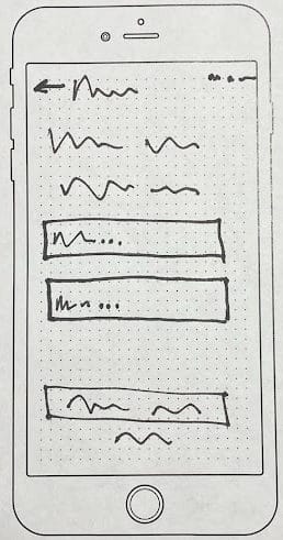
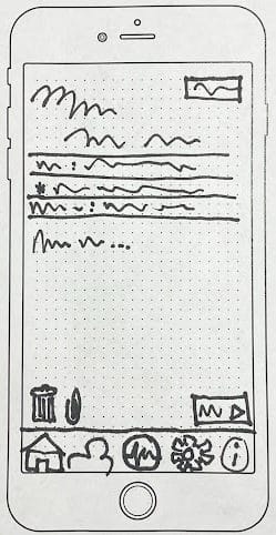
FROM SITEMAP TO WIREFRAMES
After creating and refining the sitemap, it was time to sketch my first wireframes for the application. I started by designing the main navigation for both the mobile and desktop versions.
Home screen
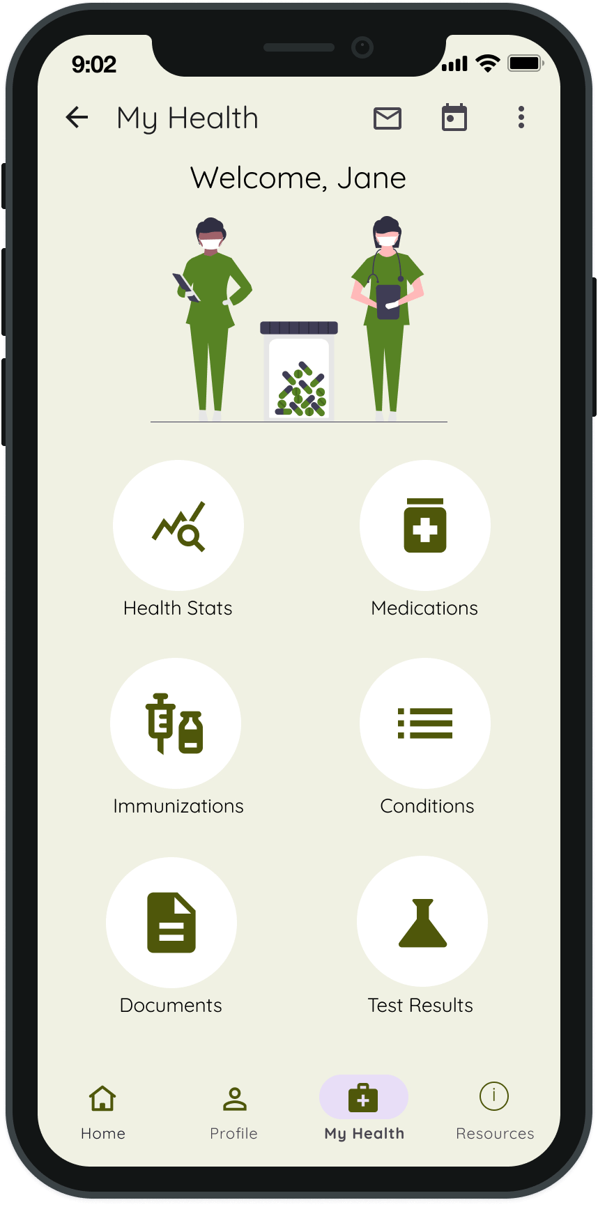
Care Center, which would get renamed as My Health
You’re Connected
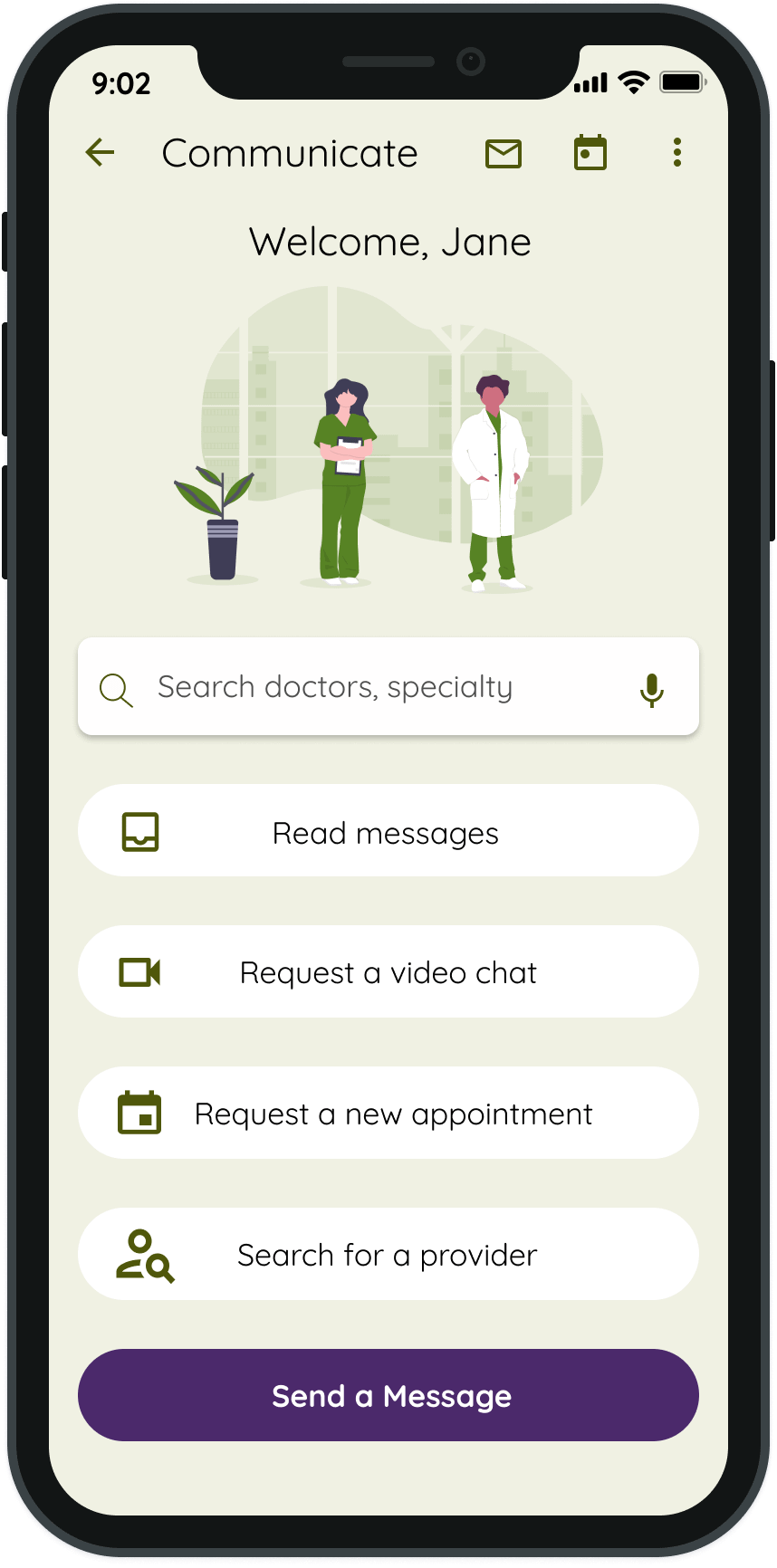
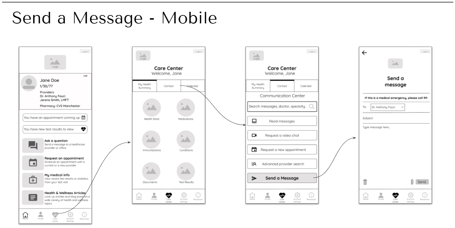
From there I created wireframes for the three core features: adding another (dependent) profile, the communications center, and finding a new healthcare provider.
The next step was to sketch the screens of the user flow for each of the three features, in both mobile and desktop.
Connect your doctor’s office
Send a message
Provider search results
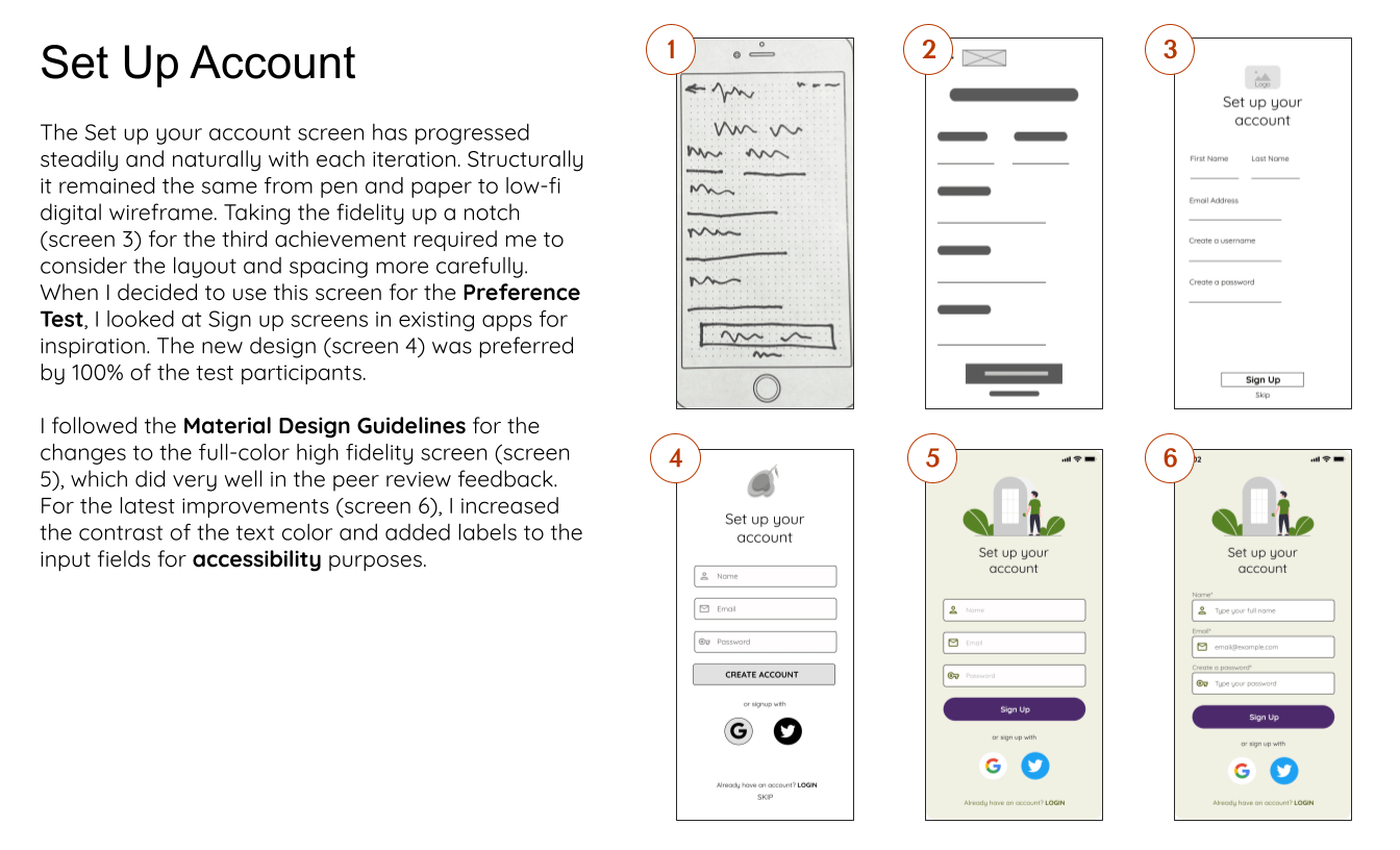
FROM WIREFRAMES TO PROTOTYPES
After creating initial wireframes with pen and paper to block out the app at a higher level, I moved on to digital prototypes. Seeing the screens in prototype form made me realize which screens were too cramped and which were missing key information. From low- and mid-fidelity prototypes with no text, I brought the designs up to a high-fidelity grayscale prototype. At this level I had to work out finer details about how individual features would work. I went back to the personas for reference, to ensure that users could accomplish the core tasks intuitively.
Test
USABILITY TESTING
After creating a possible solution to the original problem with the prototype, I needed to use evaluative research to test and potentially validate my design decisions. I conducted usability tests to find out from real users what worked well, what didn’t work well, and how they accomplished certain tasks.
TEST PLAN
Goals
Appraise the app’s learnability for new users interacting with the prototype.
Measure whether users understood the app and were able to complete the assigned tasks.
The study tested 6 participants. I recruited them from my personal network and from the CareerFoundry Slack. They represent my target audience and embody my personas.
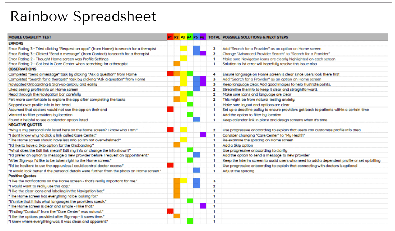
ORGANIZING THE TEST RESULTS
The first step in interpreting the data from the usability tests was to create an affinity map to separate out important comments and observations and sort them into similar categories. From here I organized the information further by condensing it into a rainbow spreadsheet, arranged into errors, observations, positive quotes, and negative quotes. This helps me and any stakeholders visualize the patterns in the results.
TEST REPORT
Issue 1:
Tried to click “Request an appt” to search for a therapist
Change: Add “Search for a Provider” as an option on Home screen.
Issue 2:
Clicked “Send a message” to search for a therapist
Change: Change “Advanced Provider Search” to “Search for a Provider”.
Issue 3:
Thought Home was Profile Settings
Change: Make sure Navigation icons are clearly highlighted on each screen.
Issue 4:
Completed “Send a message” by clicking “Ask a question”
Change: Ensure language on Home screen is clear, since users look there first.
Issue 5:
“Care Center” in navigation bar does not get clicked
Change: Change the name to “My Health.”
RESULTS
All the participants found the app intuitive overall. While all the participants completed their tasks, the majority got lost at one point. However, when the tasks were over they often felt comfortable to click or explore the navigation. I made the suggested changes to make the user experience more seamless.
Refining
DESIGN LANGUAGE SYSTEM
I created the design language system to document the design rules and guidelines for the Olive Care brand.
PEER REVIEW
I reached out on Slack for feedback on my application from other CareerFoundry students. Three fellow students, who were also on the same task, shared comments and constructive criticism. Their feedback helped me make further improvements to my high-fidelity mockups.
Final Updates
Following the peer review I evaluated the prototype for accessibility issues and made changes to ensure the app is accessible, viewable, and easy to use for everyone.
I learned a great deal on this project. Research, user and stakeholder feedback, and peer reviews were invaluable in improving the usability of this app.
As the pandemic is still an issue for so many, it will be important to make sure the video chat feature is fully developed. The pandemic has also affected people’s mental health significantly. The mental health and educational resources section of the app can be very useful to many. I plan to have the app ask the user how they feel on occasion. If they indicate they feel stressed or sad, etc, the app will invite them to explore the resources, which could result in a more positive experience.
Thanks for stopping by 👋
Let’s connect and collaborate on a project together!