Being a first-time homebuyer can be both exciting and scary, especially if you don’t have a guide. I created this app to help others navigate this stressful process and ensure they have all they need at their fingertips to buy their first home.
How might we demystify the buying process for first-time property investors?
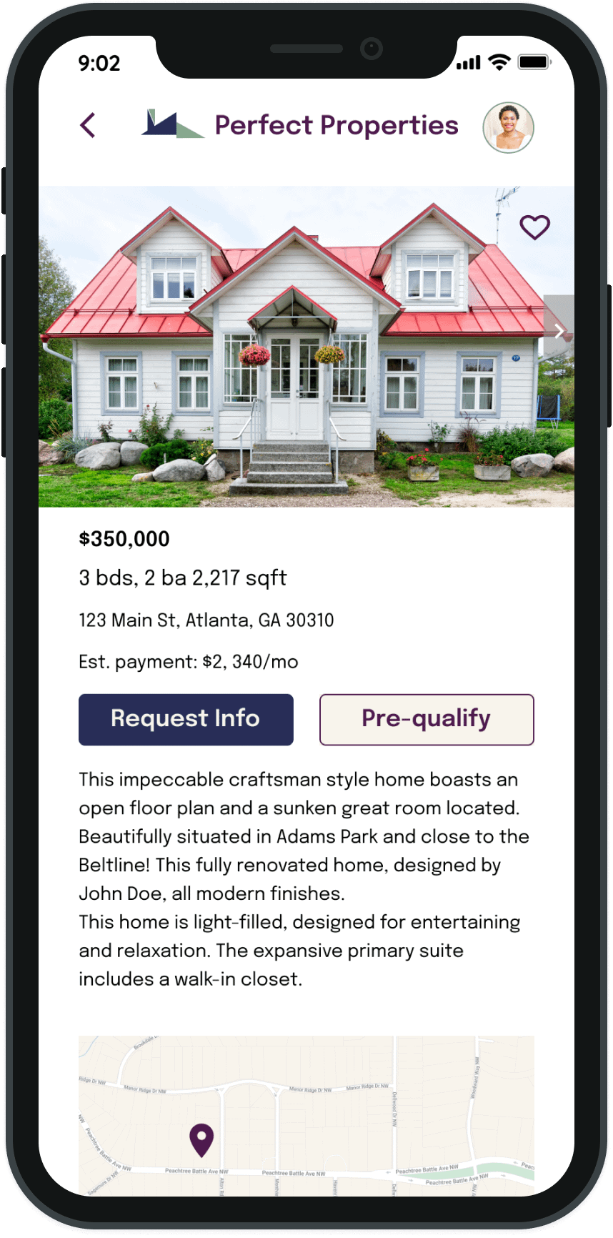
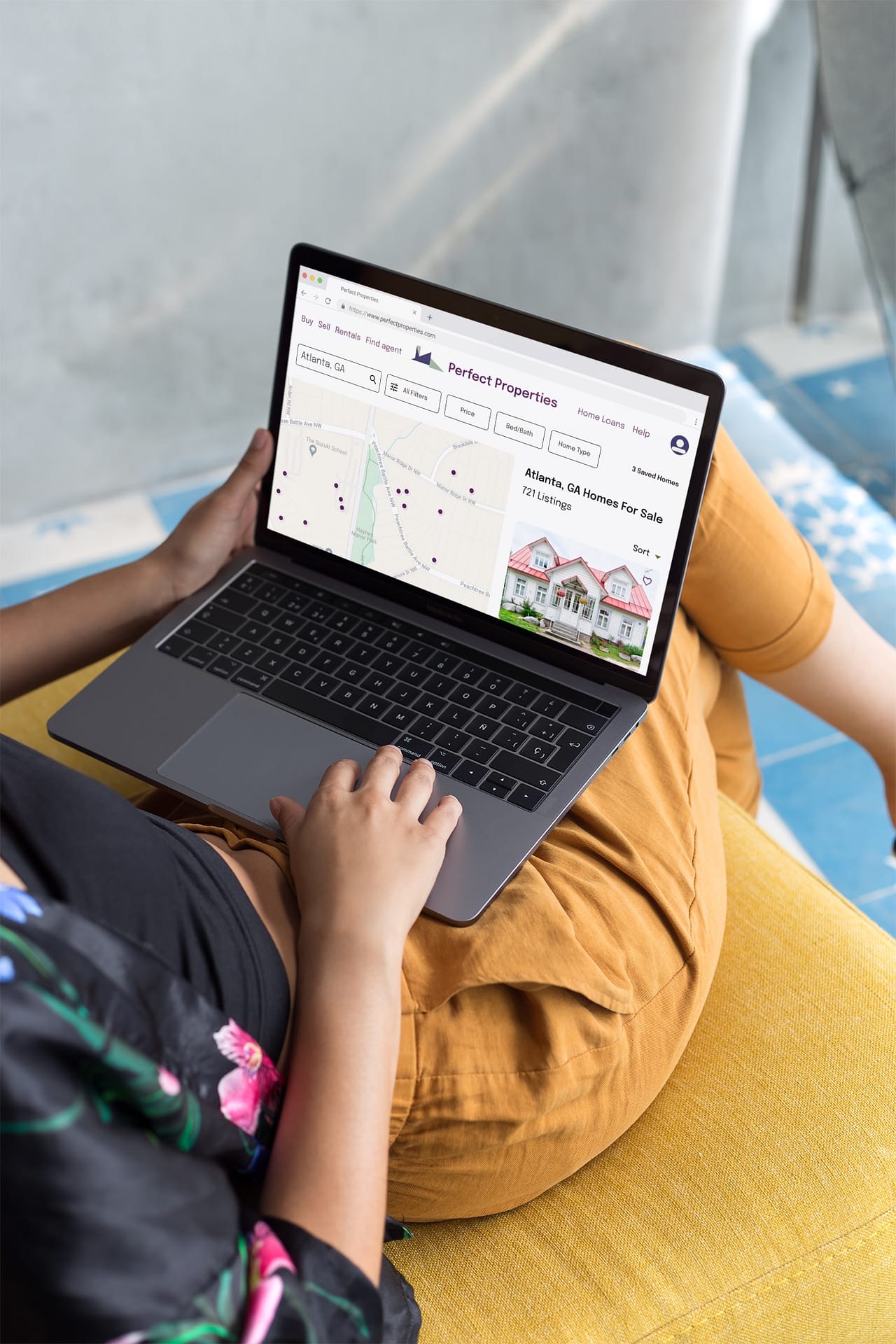
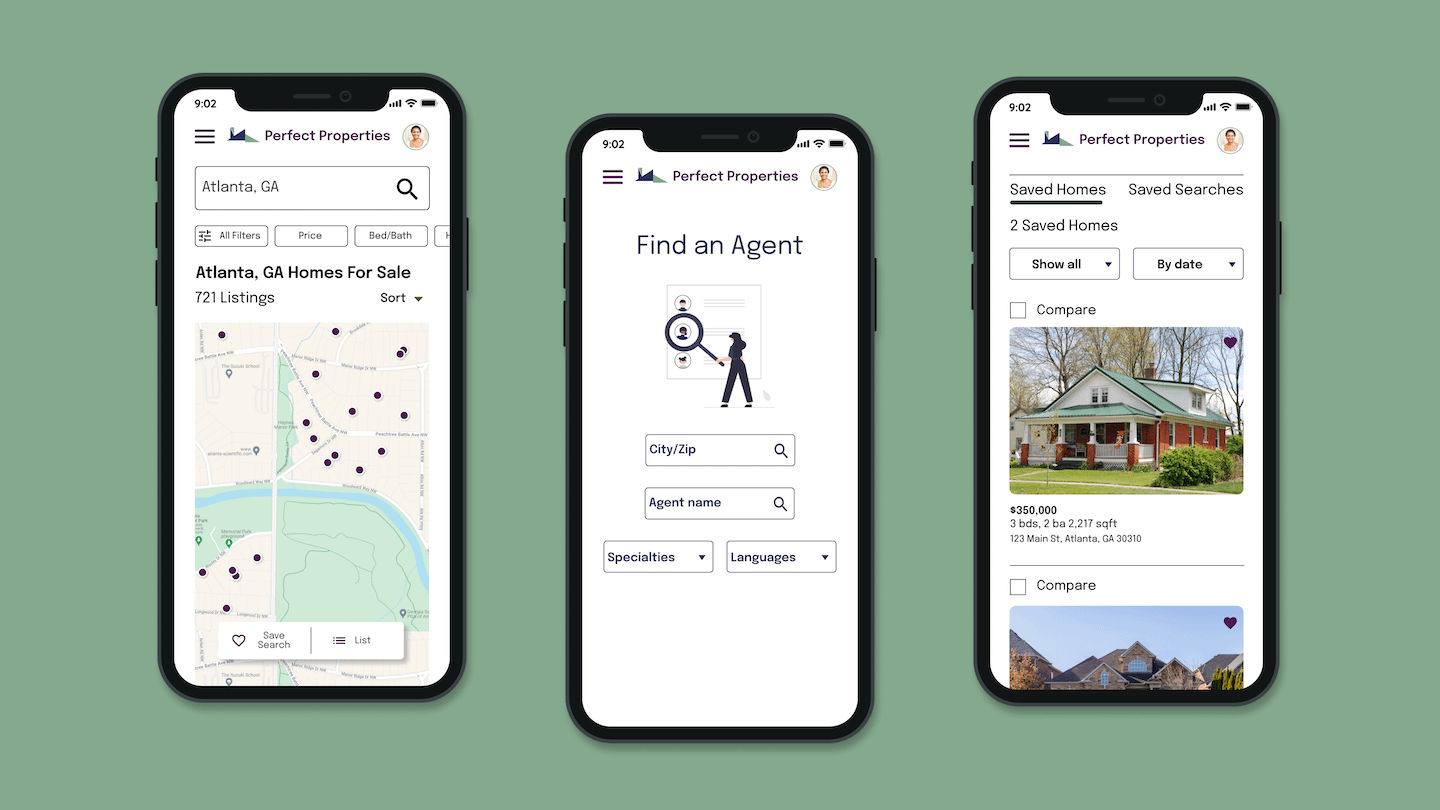
Based on the data from the design brief, the goal of this project is to create a responsive web app that provides property buyers with information on properties of interest.
Real estate investment is an increasingly popular way for individuals to achieve financial security. It is an exciting and emotional experience, but often complicated. While there are plenty of blogs and agencies providing information, often, buyers new to the market may struggle to get started without professional guidance and waste time viewing properties out of their range.
This responsive web app will provide new buyers with the expertise needed to get started efficiently.
Point of View
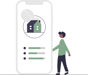
I created a Proto-Persona with the information from the brief to better understand our key users’ motivations and needs.
Using three of the provided user stories, I created the user flow diagram to visualize the pages required to ensure our users can achieve their goals.
Design & Prototype
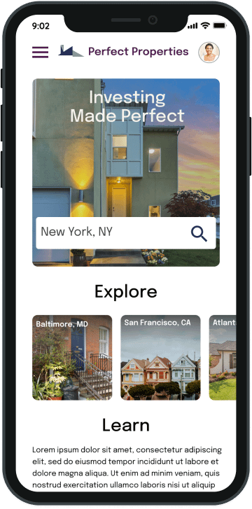
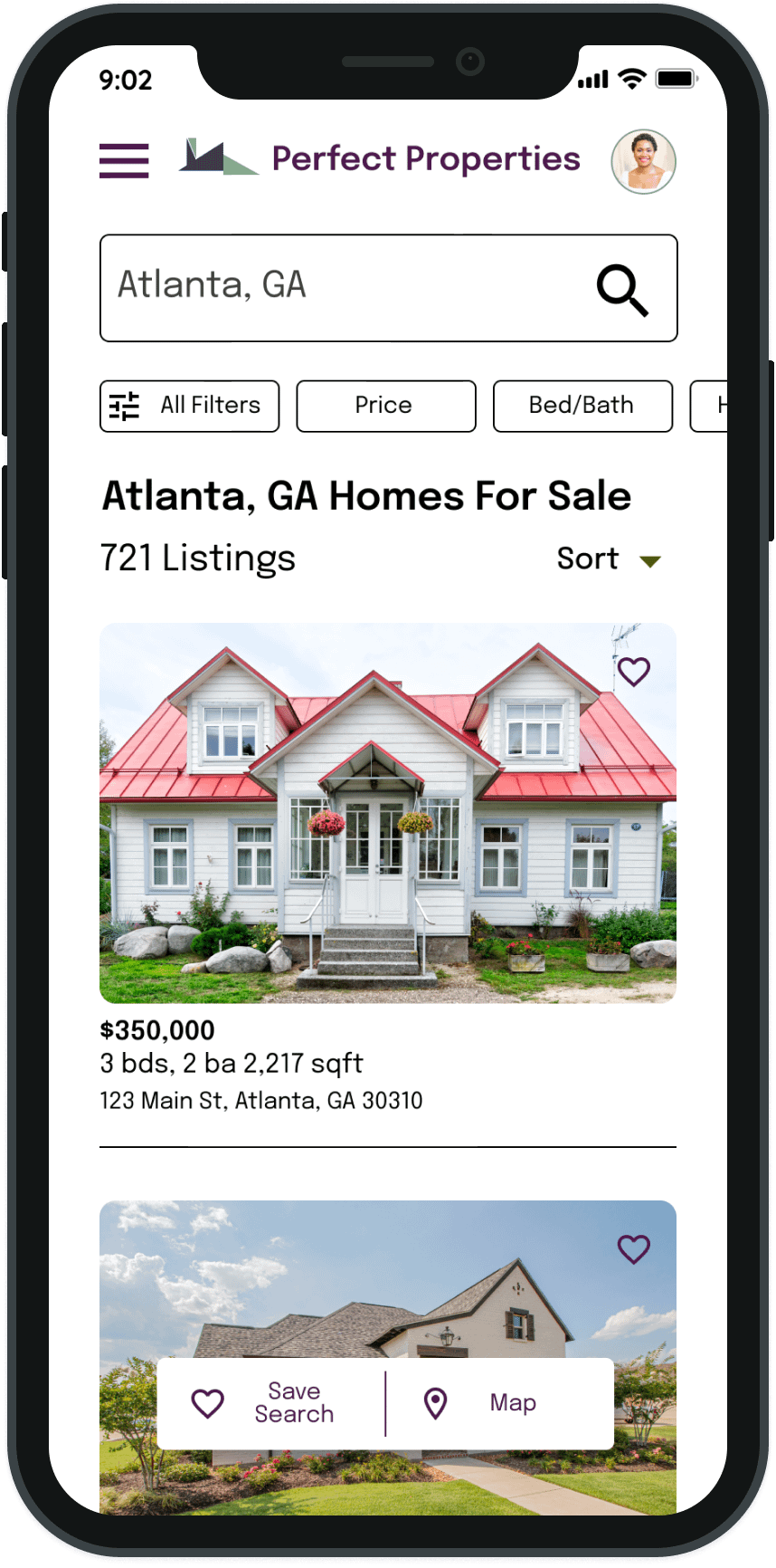
After creating the user flow diagram, I sketched the screens needed for the key features.
Low-fidelity wireframes for mobile
Low-fidelity wireframes – responsive breakpoints
After conducting brief usability tests of the low-fidelity prototype, I collected the feedback, made adjustments, and created mid-fidelity wireframes, adding UI elements basic illustrations, and some text.
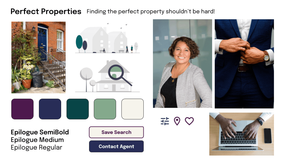
At this stage, I used information from the project brief and created a mood board to convey the tone and visual direction of the app.
Style Guide
I chose the Epilogue typeface for its clean, modern look and readability. Additionally, it comes in many fonts and is easily adapted for different uses, such as body text and headings. Font size should not go below 14 px.
The analogous color scheme of the main color palette is meant to evoke stability security, reliability, and expertise. The rich tones convey a sense of warmth and openness.
The icons follow universal design for recognition and understanding. Icons should follow the color palette, except for the error alert, which should always be red.
Illustrations should use colors from the approved color palette. Photographs native to the application should be well-lit, have good contrast and composition, and stay within the color palette.
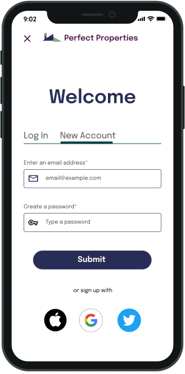
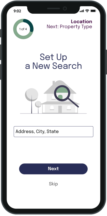
I used common UI elements to create consistency across the application.
After completing the UX Immersion program, this course was an important one to round out my skills and gain a deeper understanding of visual and interaction design.
I would like to take this UI project, with the research data that was provided to me in the beginning, and conduct usability tests to test my design decisions. Based on the feedback I receive, I would continue to iterate and expand the functionalities of the app.
Illustrations: Undraw. Photographs: Unsplash.
Thanks for stopping by 👋
Let’s connect and collaborate on a project together!